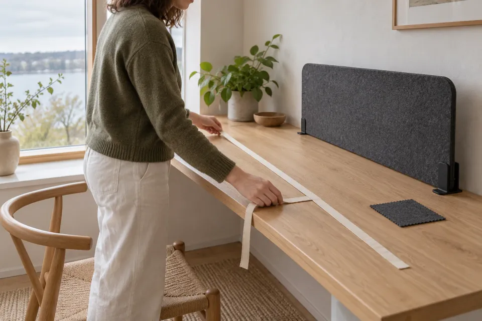
A buying decision can pause for an ordinary reason. The customer needs a measurement, a colleague’s approval or a missing file. When they return, the website should help them recognise the offer they were considering. It should not behave as if their earlier work never happened, nor should it pretend that an old price or appointment remains available.
For a ChatGPT advertiser, this is a destination-design question. It does not require identifying a person across devices or knowing what happened in their conversation. Start with what your own website can truthfully show and preserve.
Make the page recognisable on its own
Suppose a fictional supplier advertises custom acoustic desk screens. A visitor chooses a width, reads about mounting and leaves to measure the desk. Later they return through a bookmark or a link sent to a colleague.
The page needs a stable product identity, clear variant names and enough context to recognise the same offer. A headline that changes with every promotion can make the product harder to recover. Keep the product or service name distinct from temporary promotional wording.
A shareable product link can be useful when it represents the selected configuration reliably. If the link cannot preserve a choice, do not imply that it does. The page can instead show the default and make the need to select again clear. The variant destination guide covers the identity of the product reached from an ad.
Decide what should be remembered
Separate customer choices from information controlled by the business. A selected width, colour or preferred appointment period can be a remembered preference. Price, stock and available dates are current facts that may need to be checked again.
Create a small decision list for the journey. For each value, specify whether it can be restored, whether it needs reconfirmation and what happens when it is no longer supported. This is a product decision before it is a storage implementation.
| Earlier information | Useful return behaviour |
|---|---|
| Selected screen width | Show the choice and allow editing |
| Old displayed price | Retrieve the current amount and explain a material change |
| Preferred installation date | Preserve the preference without implying a reservation |
| Product no longer offered | Identify the old choice and provide a clearly labelled alternative route |
Do not save every field simply because it is technically possible. Consider the sensitivity of the information and whether the visitor expects it to remain visible on a shared device. Detailed storage and privacy implementation require their own review; the design should state the intended behaviour clearly.
Remember the choice, recheck the facts
- Width
Restore the choice if it still exists.
- Price
Show the current amount before continuing.
- Date
Preserve preference without implying reservation.
Distinguish a saved link from saved form answers
A bookmark may recover the product page without recovering a configuration. A link copied to a colleague may carry a width and colour without carrying any private enquiry details. Decide what each route promises, then open it in a fresh browser to check that the promise is true. The customer should be able to understand the link without having seen the ChatGPT ad.
For the desk screens, make a shared selection readable as “120 cm, grey, desk clamp” rather than relying on the recipient to recognise a highlighted picture. If one option has disappeared, identify that option and ask for a replacement choice. Do not silently substitute the first item in a newly sorted list.
W3C’s Redundant Entry guidance concerns repeated information within the same process and explicitly does not require storage between sessions. Moving backwards through a live enquiry is covered in the form progress guide. A later visit needs its own decision about what to retain and how to explain it.
Treat changed offers as changed offers
The old selection may no longer be available. A customer returning from a saved ChatGPT ad destination should see an understandable explanation, not an unrelated replacement presented under the original name.
For the desk-screen example, the selected material might be discontinued while the product family remains. State which part of the choice changed and let the person compare supported alternatives. If the price changed, show the current price before proceeding. Do not make an old cached display look like an active quote.
If a time-limited offer ended, preserve enough context to explain what happened. The customer should not have to infer expiry from a missing button. The expired offer guide covers that specific page state.
Give visitors control over restored state
A remembered choice should be visible and editable. Do not silently apply it to a different product because the same selector position is reused. If the visitor starts a new request, provide a clear way to begin without the earlier selections.
Be careful with wording such as “Welcome back” when the site does not actually know who is present. A neutral “Your previous selection” can still be inaccurate on a shared device unless the context is clear. The design should avoid exposing personal details merely to make the page feel personalised.
Review the journey using a fresh browser state, a return with a valid selection and a return after the offer changes. Also try switching language before continuing. The useful result is not perfect memory. It is a page that helps the customer recover the task, verify what is current and continue deliberately rather than guessing which earlier details still apply.
Sources and scope
Recovering the advertised offer and earlier customer choices on a return visit, without assuming that saved prices or availability remain valid.
Working methods and examples are editorial suggestions. Check current platform requirements and available features before implementation.