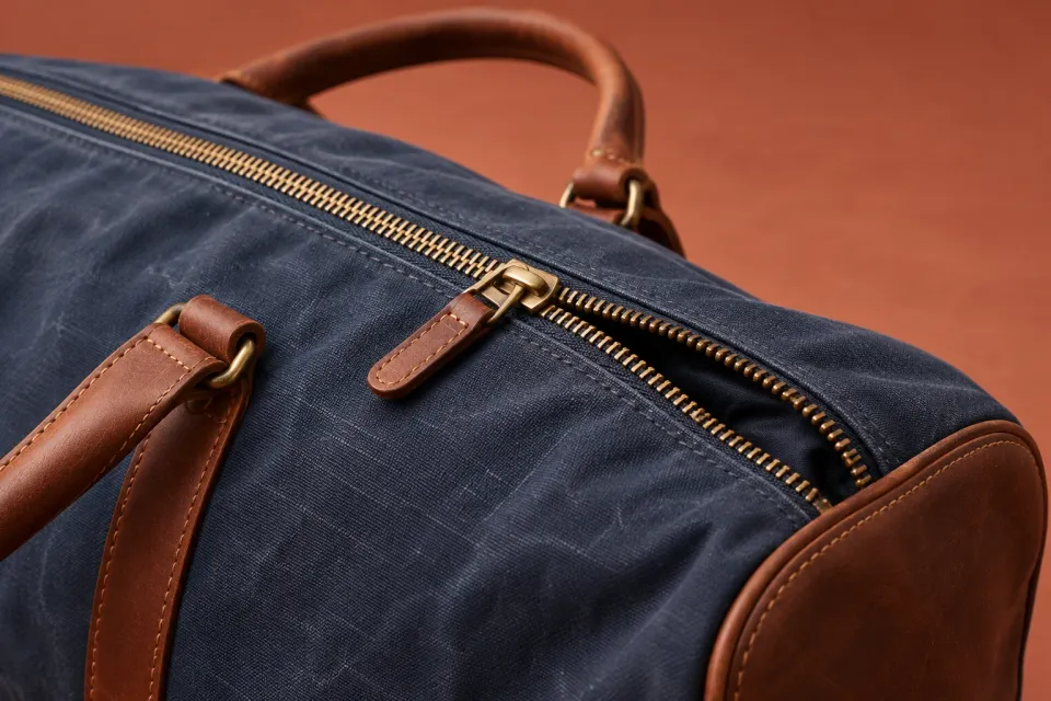
A customer opens a product page from a paid ChatGPT ad and wants to inspect a bag’s zip. The photograph exists, but the thumbnails are difficult to distinguish. A swipe moves the page. Once the customer enlarges the picture, there is no obvious route back to the product choice. In this hypothetical example, the photograph is available but difficult to use.
A mobile gallery should let customers find a view, inspect a detail and continue with the right item. This guide covers the controls and states involved. Choosing photographs and arranging their evidence belongs in the product image sequence guide. Start with a considered selection and check whether customers can actually operate it.
Begin where the ad visitor begins
OpenAI describes the ad destination in Campaign Management. For product-feed ads, the selected product supplies the image and destination URL, as explained in Product Feeds. Review the gallery through the actual destination link.
Check the initial product selection. Record the variant, active image and language before using the controls. A gallery that opens with the shop’s default colour can be misleading when the ad link refers to another colour. Treat that mismatch as something to investigate in the journey, rather than assuming the customer will interpret it correctly.
Write a specific review task: “Find the zip detail, enlarge it and continue with the bag originally selected.” This makes lost context easier to notice. Browsing casually through photographs can miss the critical return to the purchase decision.
Make additional images discoverable
Show an understandable indication of the current image and total count, such as “Image 2 of 6”. Unlabelled dots can supplement navigation but should not be the only explanation of what is available. Thumbnails need to be distinguishable and indicate which image is selected.
When several thumbnails look similar, short names can help: “Front”, “Inside” and “Zip detail”. These labels describe the view rather than its importance to the buying decision. Customers should be able to find a detail without memorising every photograph’s number.
Provide visible, understandable previous and next controls. Swiping can be a convenient additional method. Customers should still be able to change the image without knowing a hidden gesture or accurately hitting a tiny thumbnail. Check the controls’ touch areas and spacing on the actual small screen.
Separate image navigation from page movement
Try scrolling while a finger is over the photograph, changing images horizontally and using the controls. Establish whether the intended action happens or whether the gallery captures a different movement. Try the edges of the photograph too, where a finger may land near another control.
Choose an understandable behaviour at the first and last image. If the gallery loops, make it clear when the first image appears again. If it stops, its controls should communicate that state. In either case, the counter, selected thumbnail and main photograph should agree.
Avoid automatically advancing the series while a customer reads a caption or examines a detail. A gallery that changes without deliberate input makes the current view harder to inspect. The recommendation here is to let the customer control that inspection.
Give enlargement a clear exit
Make enlargement an explicit action, such as “Enlarge image”. Once it opens, the product and view should remain identifiable. Keep a relevant caption and a clearly named close control. Avoid placing the control so close to the screen edge that it becomes awkward to reach.
Provide a clear way to reset the view after moving around an enlarged photograph. If pinch gestures control zoom, offer controls that allow the same inspection without requiring that gesture. Enlargement should reveal information present in the file; a blurred image should not appear to substantiate detail it cannot show.
Closing should restore the correct image, variant and position on the page. Try the browser’s back control too, and decide which behaviour is appropriate for this implementation. An unexpected return to the previous website can interrupt the product decision. Record such transitions with the steps that caused them.
Keep captions and variants attached
A caption shown only below the closed gallery can lose its explanatory role in the enlarged view. Preserve information that changes how customers should interpret the photograph: an accessory is sold separately, another variant is illustrated, or dimensions apply to a particular configuration.
When customers change variants, review the main photograph, thumbnails, captions and image counter together. Decide what happens when the new variant has no equivalent detail photograph. Show an identified available view or explain the limitation. Do not reuse another variant’s photograph in a way that appears to confirm the selected item.
Dimension diagrams also need readable values and corresponding text. The dimension-diagram guide covers that material itself. The mobile review checks whether customers can open, read and leave the diagram while keeping their selection.
Keep context across four gallery states
- Overview
The active thumbnail, counter and clear controls show the current position.
- Enlarged image
The relevant caption, reset and close controls remain with the detail view.
- New variant
Images and captions update together or explain an unavailable view.
- Return to purchase
The correct product selection and page position remain when the gallery closes.
Review incomplete and failed loading
Try the gallery when a photograph loads slowly or fails to appear. Distinguish waiting from failure, and keep other available images accessible. An empty frame needs an explanation and a reasonable next action. Avoid trapping the product choice behind an enlarged view with no usable content.
Check whether the gallery’s height changes as different photographs arrive. If the product choice or purchase control moves unexpectedly, investigate the cause. The broader layout stability guide helps describe that movement without confusing it with an image-order problem.
Use a short review record to keep findings reproducible:
| Record | Useful detail |
|---|---|
| Starting state | Ad URL, selected variant and active image |
| Intended action | The detail the customer is trying to inspect |
| Observed result | What changed, disappeared or became unreachable |
| Completion check | Whether the customer could return to the same choice |
These are observations from your own review, not evidence of a conversion improvement. A fix is ready to assess when the original steps can be repeated and the customer can finish the intended action.
Finish with one continuous walkthrough on a small screen: open the ad destination, find the detail, enlarge, reset, close, change a relevant variant and continue towards the cart. Repeat the whole route using only the keyboard. Check that users can operate the gallery, close enlarged views and continue from a sensible focus position. Check visible focus and meaningful control names, following the W3C guidance on accessible carousels. Record the action that could not be completed and the state in which it failed. That gives the next change a concrete purpose: let customers inspect the product and then continue their purchase decision.
Sources and scope
Review how customers arriving from paid ChatGPT ads find, enlarge and navigate product images on a small screen, then return to their selected product.
Working methods and examples are editorial suggestions. Check current platform requirements and available features before implementation.