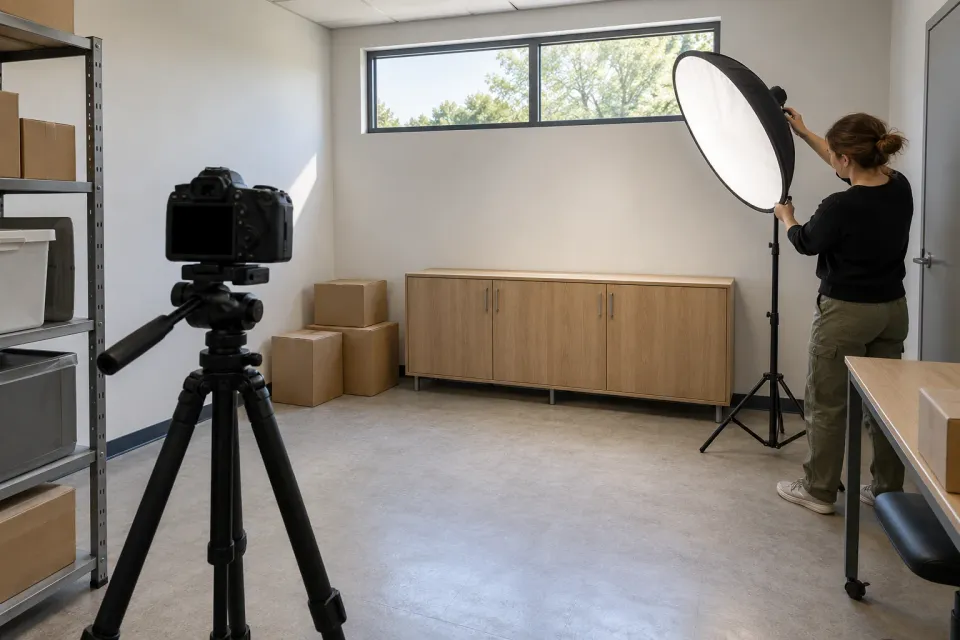
A crowded room photographed in dim light and a tidy room photographed from another angle can create a dramatic contrast. The contrast does not by itself explain which part came from the advertised service.
When a ChatGPT ad destination uses before-and-after material, the visitor needs to understand what changed, what remained comparable and what the business actually did. Treat the pair as an evidence presentation with a defined question, rather than as a decorative way to make the page persuasive.
Decide what the pair is intended to show
Write one factual purpose for the comparison. It might show a repaired surface, a different storage arrangement or the appearance of an installed item. Avoid a vague purpose such as “demonstrate transformation,” which can absorb claims the material does not support.
Separate appearance from performance. Photographs can show where shelves were placed, but they do not establish how much time employees saved retrieving materials. If the destination makes that operational claim, it needs an appropriate record beyond the visual pair.
Use the claim-register guide to identify the exact statement before selecting images. Otherwise the strongest-looking contrast may determine the promise, rather than the documented work determining the presentation.
Establish that the images belong together
Check that both views concern the same subject and that their dates and relationship are known. Two similar rooms are not a before-and-after pair merely because one is untidy and the other looks complete.
Record relevant conditions: camera position, lighting, staging and any work between the images. Perfectly identical photography is not always possible in an existing project archive. When differences affect interpretation, explain them instead of pretending the comparison is controlled.
The ASA CAP guidance on before-and-after photos is a useful reference for treating these presentations as advertising claims that need support. The workflow here is an editorial review, not a claim that following a particular layout establishes compliance in every market.
Work through a storage example
Consider a hypothetical destination advertising office-storage installation. The proposed “before” image shows boxes on the floor. The “after” image shows fitted cabinets, brighter lighting and fewer belongings. The cabinets may be the provider’s work; the lighting change and removal of belongings may have other causes.
A fair caption would identify the installed storage and explain any customer-led clear-out that materially changes the scene. If the business cannot establish the relationship between the images, it should use a finished-work image with an accurate caption instead.
Do not manufacture a worse starting image or digitally remove inconvenient details to intensify the contrast. A conceptual illustration can explain a possible arrangement when clearly labelled, but it should not be presented as evidence of a completed customer project.
What changed between two hypothetical images?
- Storage installation
Document the work the provider actually performed.
Checkpoint - Lighting and angle
Differences can strengthen an impression without showing the service's effect.
Reconsider - Removed belongings
Explain the customer's own contribution to the change.
Explain the intervention and its boundaries
Describe what the provider supplied, changed or repaired. If other contractors contributed, identify the relevant division of work. The visitor should not infer that everything visible in the after image was included in the advertised package.
Include the elapsed period when it matters to interpreting the result. A photograph taken immediately after work may show a different condition from one taken after prolonged use. Do not imply durability from an immediate finish photograph alone.
A fuller case study can hold the project narrative, while the destination presents a bounded visual extract. Keep the extract truthful on its own, because many visitors will not open the longer account.
Make the comparison usable without dragging
A slider can be visually engaging but should not be the only way to access the two states. The visitor may use a keyboard, a screen reader or a device where dragging is difficult. Provide clear labels and a supported way to inspect each image.
For a custom comparison slider, offer controls that can be clicked or tapped without dragging, such as buttons to reveal either complete image. W3C’s dragging-movements guidance distinguishes this pointer alternative from keyboard access: arrow-key support alone does not solve the problem for someone using a touchscreen. Check both ways of operating the comparison.
W3C’s informative-image guidance explains the role of meaningful text alternatives. Describe the information the comparison communicates, while keeping essential context available in visible text as well.
Do not rely on left and right alone for identification. A mobile layout may stack the images, and a screen reader may encounter them in a different context. “Before installation” and “After installation” are more stable labels when those descriptions are factually correct.
Keep numerical overlays separate from visual impressions
A large percentage placed over the after image may be read as a measured effect of the service. Verify its basis and explain what it measures. A photograph cannot supply the missing denominator, comparison period or method.
If the numerical claim concerns space, distinguish nominal cabinet capacity from usable storage in the actual project. If it concerns time or cost, identify the data supporting that claim. Do not add a number merely to make an image pair look analytical.
A portfolio presentation may be sufficient when the goal is to show appearance and execution. There is no need to force every attractive completed project into a causal before-and-after story.
Review the final impression, not just each file
Look at the pair with its headline, caption and call to action. Ask what outcome a new visitor would expect for their own situation. A small note saying results vary cannot repair a presentation that otherwise implies a guaranteed transformation.
Verify the approved use of the source material and keep the original files with the project record. When translations or redesigns move captions, repeat the review so essential context stays with the images.
The comparison is ready when a visitor can explain what the pair demonstrates and what it leaves unresolved. That makes the visual useful to the decision behind the ChatGPT ad without asking it to prove more than the documented work supports.
Sources and scope
Make a visual before-and-after comparison interpretable through the same subject, stated conditions and a bounded change without treating images alone as proof of effects.
- ASA CAP: Before and after photosRead
- W3C WAI: Informative ImagesRead
- W3C: Understanding Dragging MovementsRead
Working methods and examples are editorial suggestions. Check current platform requirements and available features before implementation.