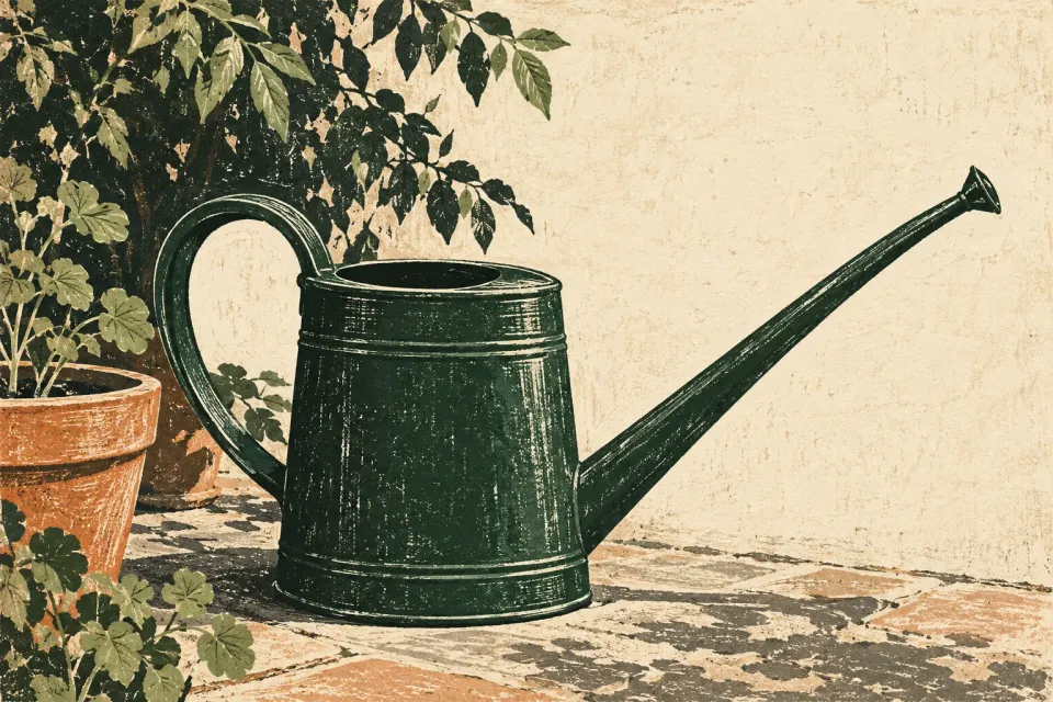
A dark green watering can against green leaves may fit a brand palette perfectly while remaining difficult to understand. Its spout disappears into the foliage, the handle resembles a shadow, and a label crosses both light and dark areas. A contrast review should identify the specific relationships causing confusion so production can correct them without restarting the whole creative idea.
This guide concerns separation inside a ChatGPT ad asset: product from background, text from its supporting surface, and meaningful markers from one another. It is an editorial review method. It does not describe a special OpenAI contrast requirement or replace a complete accessibility assessment. The practical output is a set of precise corrections and a reason for each.
Decide what must be distinguishable
Before reviewing, identify three things: the main subject, the relevant detail and any message inside the image. In this fictional example they are the watering can, its narrow spout and a short label about use among balcony pots. If everything is equally important, every correction becomes another attempt to attract attention rather than clarify the offer.
Read the brief to understand the detail’s job. The spout matters because it shows how the can is used between pots. A decorative reflection on the body does not need equal emphasis. The review should preserve the intended meaning rather than give every part of the picture the strongest possible contrast.
Then put the brief aside. Someone encountering the ad will not have access to the producer’s explanation. If the shape only becomes understandable after a spoken description, the image is not providing enough guidance. Note the area requiring attention and the precise element the viewer needs to separate from its surroundings.
First pass: subject against setting
Follow the product’s outline. Where does it disappear? The watering-can spout might meet a leaf with similar darkness and direction. That is a local problem. Brightening the entire image could weaken other areas without resolving the specific overlap that makes the spout difficult to recognise.
Try a simpler area behind the spout, a less detailed background or a different product position. Preserve the actual colour and shape. Turning a dark green model pale yellow solves a graphic problem by depicting a different product. Likewise, avoid adding a glowing edge that could be interpreted as a real product feature rather than a production effect.
Review shadows and reflections as shapes too. A strong shadow can make the spout appear wider, while a bright reflection may resemble an opening or a different material. The correction need not remove all natural variation. It should make the relevant form understandable in the chosen environment while keeping the product recognisable and accurate.
Second pass: text against its immediate surface
Inspect the area directly behind each word. A label may begin over a dark pot and finish over a bright wall. One text colour will then behave differently along the same line. An overall impression of the picture cannot tell you whether the actual wording remains readable throughout its length.
First consider moving the text onto a quieter area if the composition allows it. A restrained backing panel is another option. Make sure the panel does not hide the product detail the ad was meant to explain. Heavy shadows and multiple outlines around letters can create new clutter rather than resolving the original conflict.
Also ask whether that text needs to sit inside the image. If it repeats the ad title, another division of work may produce a clearer result. Use the guide to dividing information between text and image when the problem comes from overloading the asset rather than from one unfortunate colour choice.
Third pass: distinctions carried only by colour
Two markers can have different colours and still be difficult to distinguish in the actual composition. If their meanings are “included” and “optional”, the reader should not have to guess a colour code. Add brief wording, a clear shape or another explanation that preserves the same distinction without relying on hue alone.
A temporary greyscale view can help you inspect light and dark relationships. It may reveal that the product and background merge when the colour difference is removed. It does not simulate every way people perceive colour or prove that the material is accessible. Treat the result as a question to investigate rather than an automatic approval stamp.
For the watering can, the spout’s outline should remain understandable when the green tones become similar. A different background texture may help, but introducing many more lines could create another competition with the product. The aim is a useful distinction, not simply a different-looking image.
Make the feedback actionable
Write comments with a location, a problem and an intended effect. “The tip of the spout merges with the leaf behind it; move the leaf so the tip’s shape is clear” gives production a concrete task. “More contrast” leaves the producer to guess both the area and the intended result, making another round of review more likely.
| Observation | Reasonable first change | Check afterwards |
|---|---|---|
| Handle disappears | Simplify the area behind the opening | The handle still has the correct shape |
| Label crosses several tones | Move the text or add a uniform surface | No important detail is hidden |
| Status differs only by colour | Add an explicit label | Meaning is clear without the colour code |
Use clear creative annotations to consolidate feedback when several people review the asset. Prioritise misunderstandings about the product and message over small differences in aesthetic preference. A comment should explain what the buyer cannot currently distinguish, rather than merely assert that one reviewer dislikes the treatment.
What makes the watering can difficult to read?
- The spout disappears
Simplify the area behind the outline. Do not change the actual product colour.
Reconsider - The label crosses tones
Move the text to a uniform area or give it a restrained backing.
- Only colour explains
Add words or a clear shape when two markers have different meanings.
- The hierarchy holds
Approve when the product, relevant detail and message can be distinguished without explanation.
Checkpoint
Recheck the selected file
OpenAI describes the image as part of ad content. Review the file actually selected for use. Campaign Management
Hints provide context, not exact keywords or guaranteed placements. Contrast choices therefore remain communication decisions. Targeting
Open the export and repeat the three passes. A background adjustment may help the product while making the label harder to read. Once separation works, continue with legibility at small display sizes, which addresses a different question: whether detail and wording survive a smaller presentation. Approve contrast when the important elements are distinguishable and the corrections still depict the right product.
Sources and scope
Identify and correct weak visual separation within an ad image while preserving the actual product appearance.
Working methods and examples are editorial suggestions. Check current platform requirements and available features before implementation.